When you know how to create a histogram, you move from knowing a little bit about a process to knowing a lot. When you know your process, you’ve gone a long way towards making big improvements. Learn how to make a histogram in this short article, and discover hidden information about your process.
Why bother Creating a Histogram?
If creating a histogram is too close to a middle school math lesson for comfort, bear with it for a while longer. It’s worth the effort.
Imagine you manage a call centre – wouldn’t it be neat to know when you’re customers are most likely to call and increase your staffing to cope with the peaks, and give staff breaks during the quiet times? Or if you produce widgets, wouldn’t it be great to get all of them out the door instead of creating piles of rejects, or worse, customer returns?
What Does A Histogram Do?
- Transforms unwieldy data into easily understood visual information
- Quickly illustrates the underlying distribution of the data.
- Provides insight to predict the future performance of the process
- Answers the question – “can this process meet my customers’ needs?”
How To Create A Histogram
- Decide on the process measure – is it time, size, weight, speed that you’re going to measure? Or something like “marks out of 100” for an exam result?
- Collect at least 50 to 100 data points. Any fewer and you will have less detailed information, and any more and it might be too time consuming or costly to collect.
- Consider the time-frame that you’re measuring – does it fairly reflect the process? Is there a marked difference between shifts, days, months? If you can’t get “fresh” data, take a look at some historical data to give you a baseline for your process.
- Prepare a “distribution frequency histogram table.” This sounds scarier and harder than it actually is, so don’t fret!
- Count the number of samples “n”. In the example given later, we are using the thickness, in centimetres, of a fictional widget.
- Determine the range for the entire sample “R” (the smallest value subtracted from the largest value).
- Create 6-12 “class intervals”, with a “class width” of range divided by number of class intervals. (Round up the class interval range if appropriate). Each data point can fall into one, and only one class interval, so ensure that this is the case.
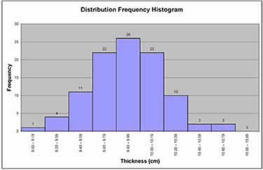
- For example, you have a sample size “n” of 100.
- The range is the highest number 10.7 minus the lowest number 9.0 = 1.7. You choose to have 10 class intervals. The class width is the range 1.7 divided by number of class intervals 10 = 0.17, which can be rounded up to 0.20. Your class intervals are therefore 9.00 to 9.19, 9.20 to 9.39, 9.40 to 9.59 etc up to 10.80 to 10.99
- Construct a frequency distribution table as below.
- Convert the frequency distribution table into a frequency distribution histogram, in excel or something similar.
- Ask yourself some key questions and you will find out if your process is meeting or missing your customers’ needs.
- What is the process mean? If the mean (average) value is way above or below your customers’ specification, you’re doing something wrong and need to correct it.
- What is the variance? If the variance is very high, chances are you will miss your customers’ needs a high percentage of the time, creating costly waste and rework. You could say your process is “not capable” of doing the job. If the variance is very small, maybe your process is too “good” and could be loosened up to free up time and money – conversely, maybe your consistency could be a selling point?
- What shape is your histogram? If you have two peaks in your data, maybe you have two processes going on, for example one machine produces larger thickness than the second. Or maybe the distribution is skewed in one direction, maybe telling you that the machine thickness settings gradually work loose as the shift goes on, producing thicker and thicker pieces.
| Class Interval | Frequency | Total |
| 9.00 – 9.19 | I | 1 |
| 9.20 – 9.39 | IIII | 4 |
| 9.40 – 9.59 | 11 | |
| 9.60 – 9.79 | 22 | |
| 9.80 – 9.99 | 26 | |
| 9.80 – 9.99 | 26 | |
| 10.00 – 10.19 | 22 | |
| 10.20 – 10.39 | 10 | |
| 10.40 – 10.59 | II | 2 |
| 10.60 – 10.79 | II | 2 |
| 10.80 – 10.99 | 0 |
Learn more about your process by creating a histogram. You’ll get good manager grades when you make great, measurable and sustainable process improvements. Knowing how to create a histogram is easier than you think!